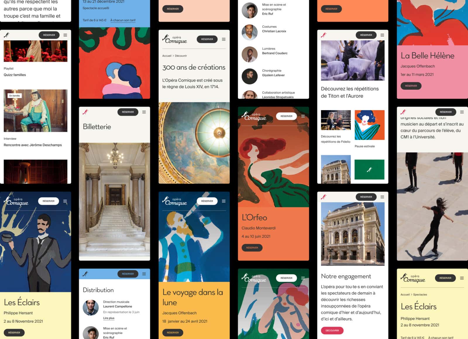
We overhauled the existing site to build a new, clear arborescence based on circulation by interests and needs: On show (immediate need), Discover (projecting oneself), Support (joining the project).


When creating the wireframes, bridges were built between the various activities of the institution. The aim: to serve the user paths identified in a transverse manner.


In the design phase, the site has been expanded with large visuals and photos to show the full richness of the venue. The site benefits from a new secondary typography and a color system adapted to the Opéra Comique’s seasons.


