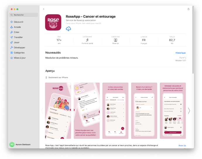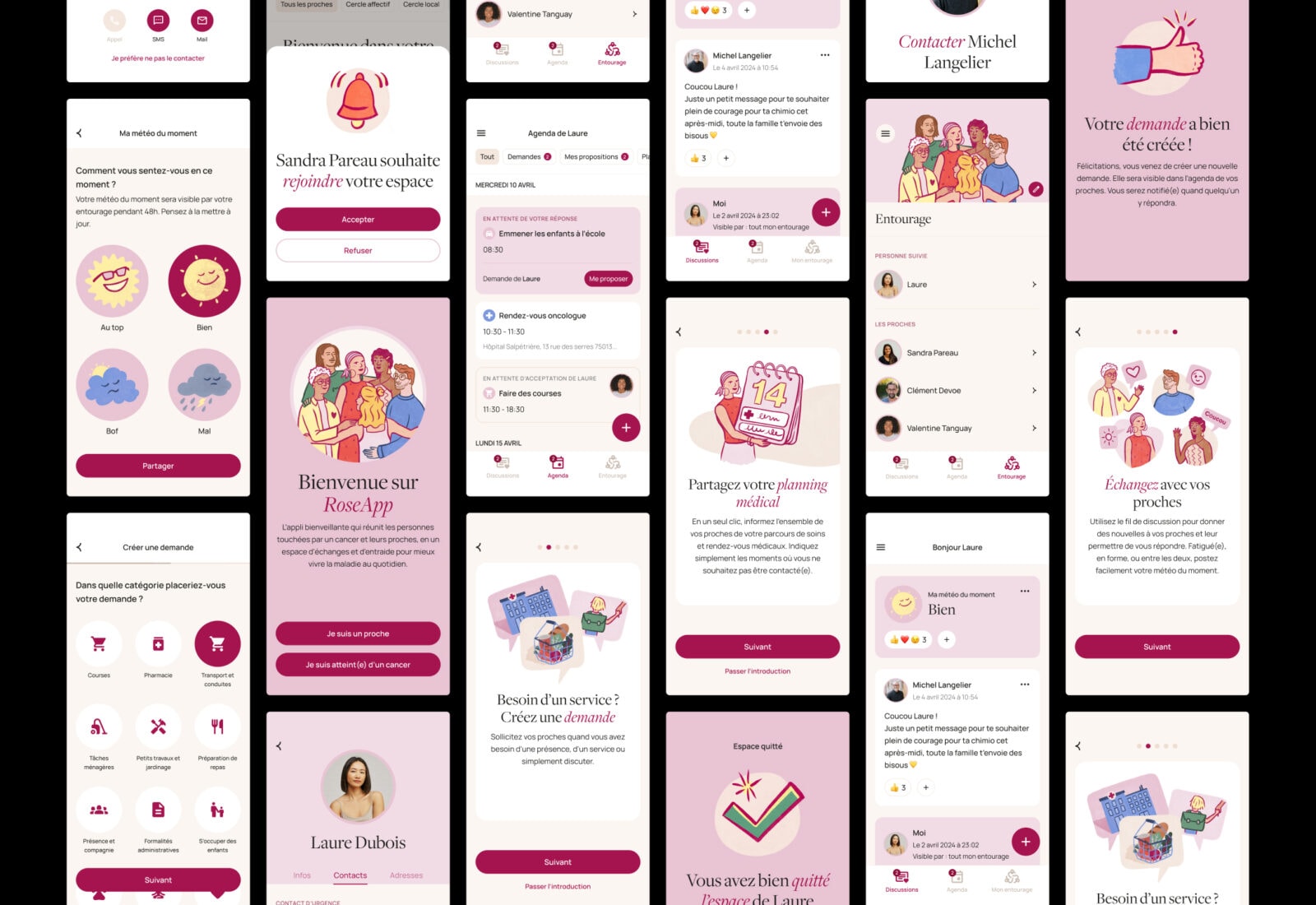
The objective was to make daily life easier for the person affected: no more copying and pasting into multiple WhatsApp groups, sharing one’s mood of the day in a single click, making requests without fear of being a burden, and centralising everything to avoid duplicated offers of help.
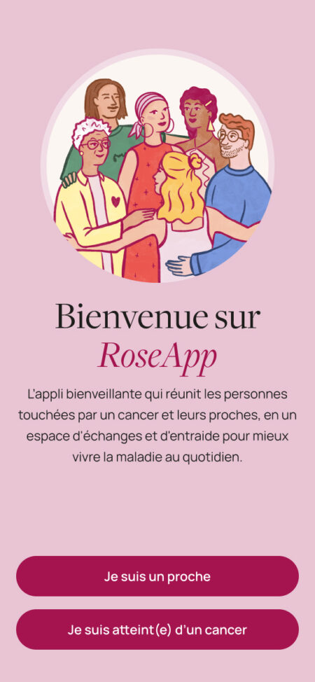
Two interfaces are available depending on the user’s status (relative or person living with cancer), determining the features accessible to each profile.
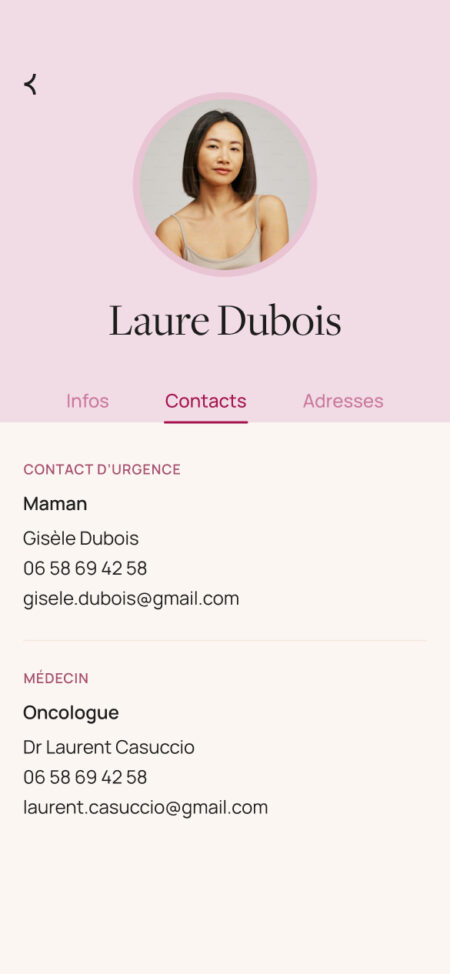
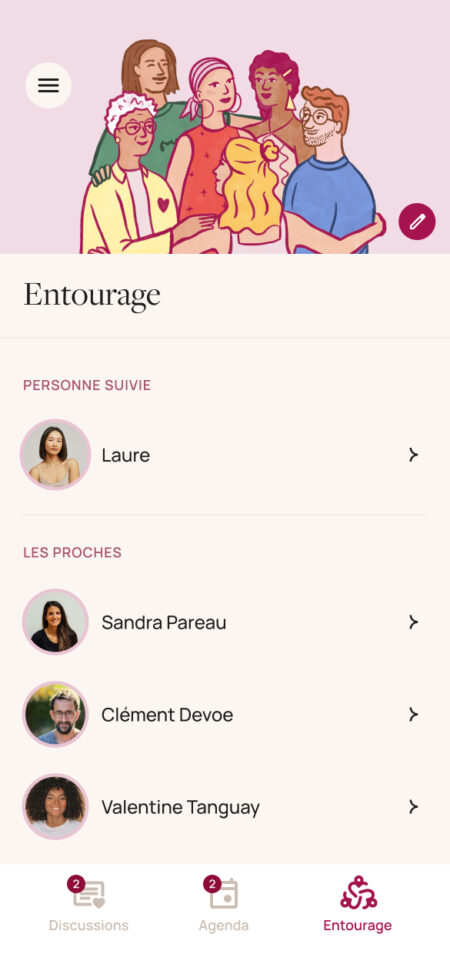
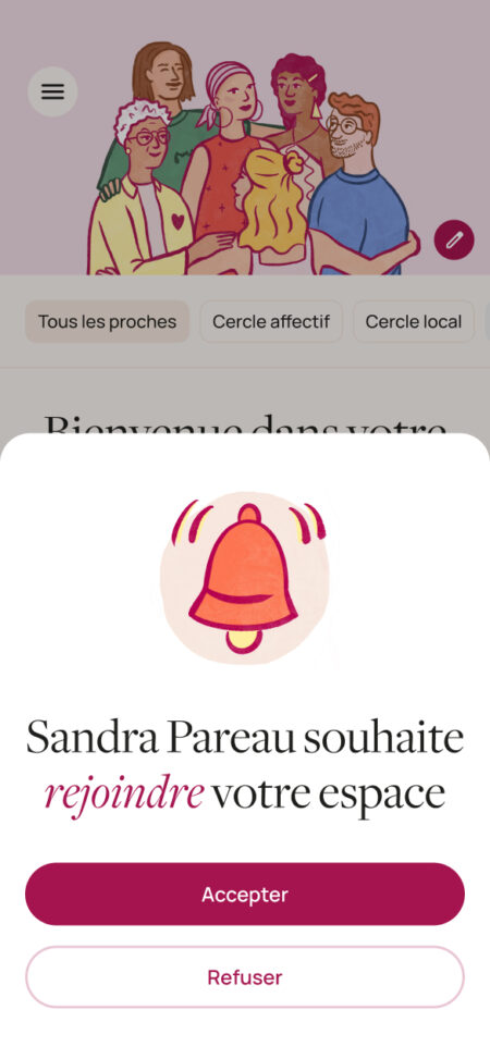
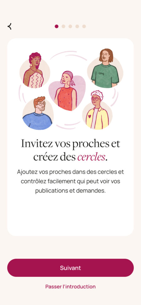
The person living with cancer can invite their loved ones into a private space that they fully control, and create discussion circles with them, allowing each post to be addressed to the people of their choice.

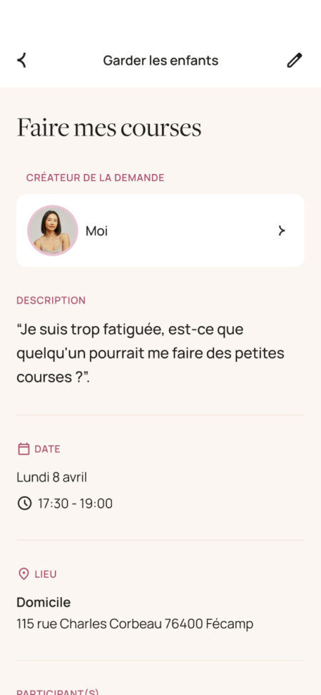
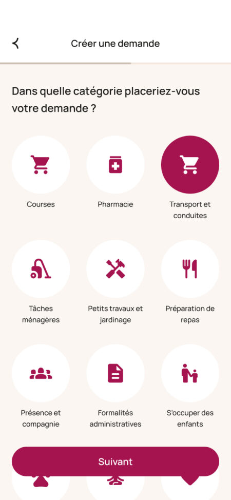
They can make requests to selected relatives, for example:
-
asking a geographically close circle for help with grocery shopping
-
suggesting a coffee break to friends in their “Best friends” circle
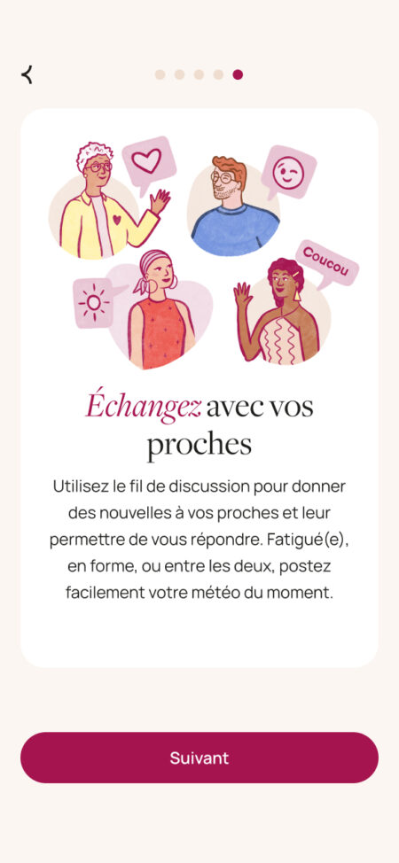
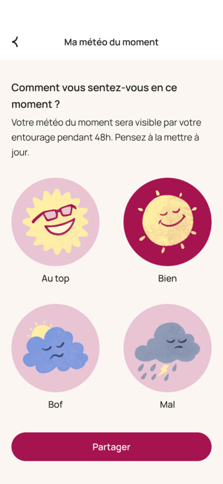
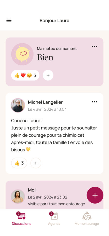
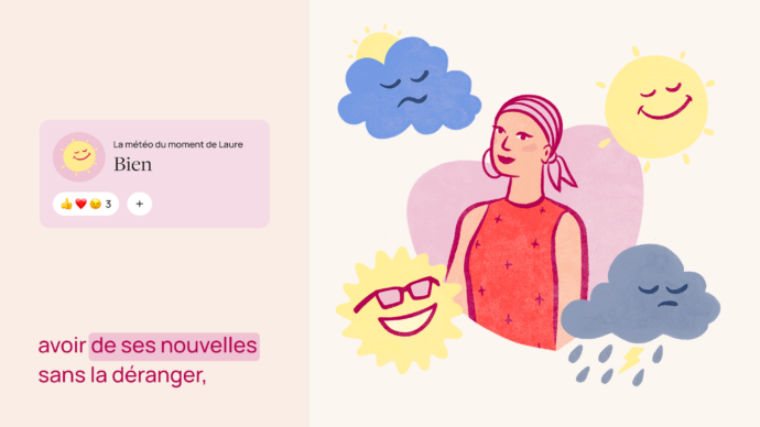
A discussion feed allows everyone to post messages and photos. The person living with cancer can also share their mood of the day with a single click.
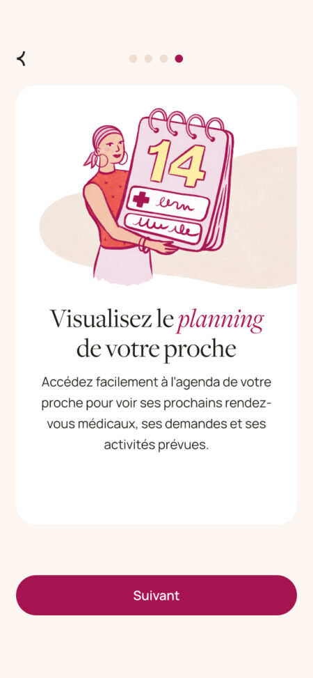
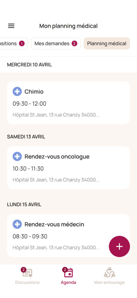
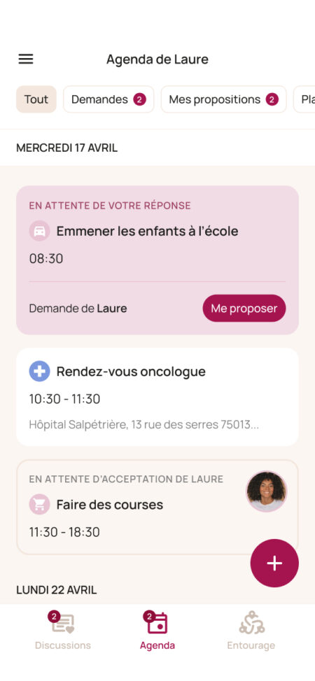
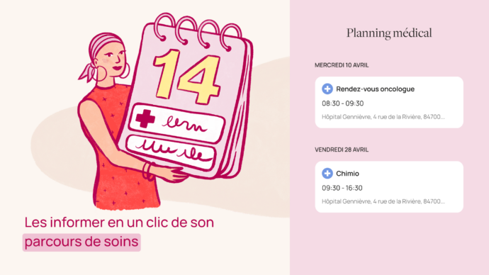
The calendar feature brings together:
-
the medical schedule, including appointments and procedures
-
requests made by the person living with cancer
-
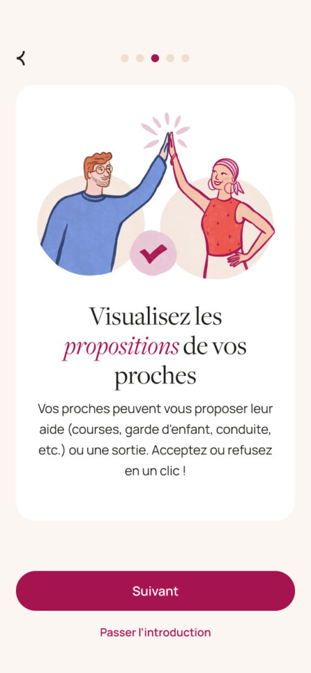
proposals from relatives
-
periods of unavailability


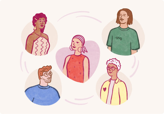



All illustrations in the application were drawn by Julie, a designer at Datagif.



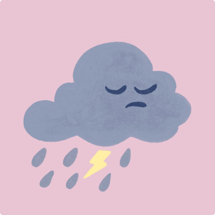



To promote the application, we produced an animated video presenting the product and its benefits.


Behind the scenes of the app creation
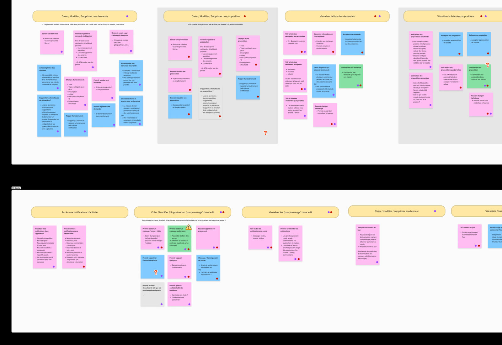
Step one: focus groups and mapping
-
interviewing two groups of people to understand their needs
-
sorting and listing features in detail
-
defining priorities for version 1 and planning others for versions 2, 3 and 4
-
determining which features are available to relatives, to people living with cancer, or to both
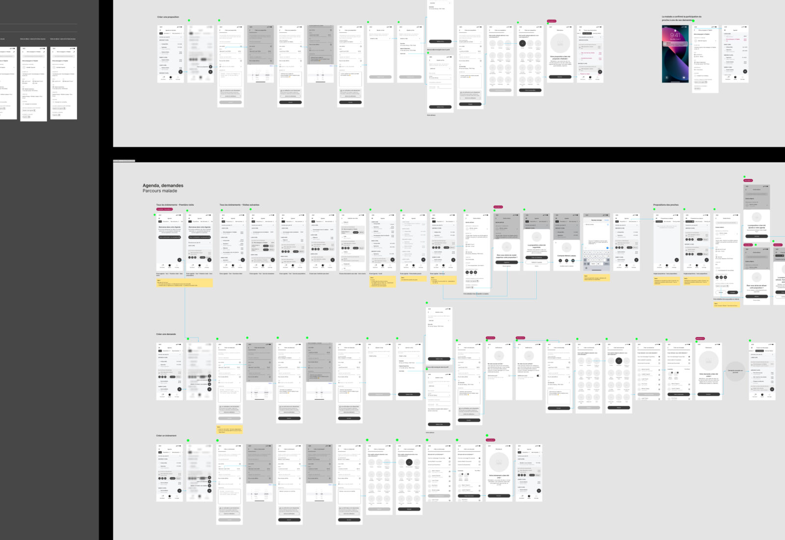
Step two: wireframes and prototype
-
transforming feature ideas into screens, first in schematic form
-
splitting screens into two user journeys for the two profiles
-
creating a Figma prototype to navigate this initial draft
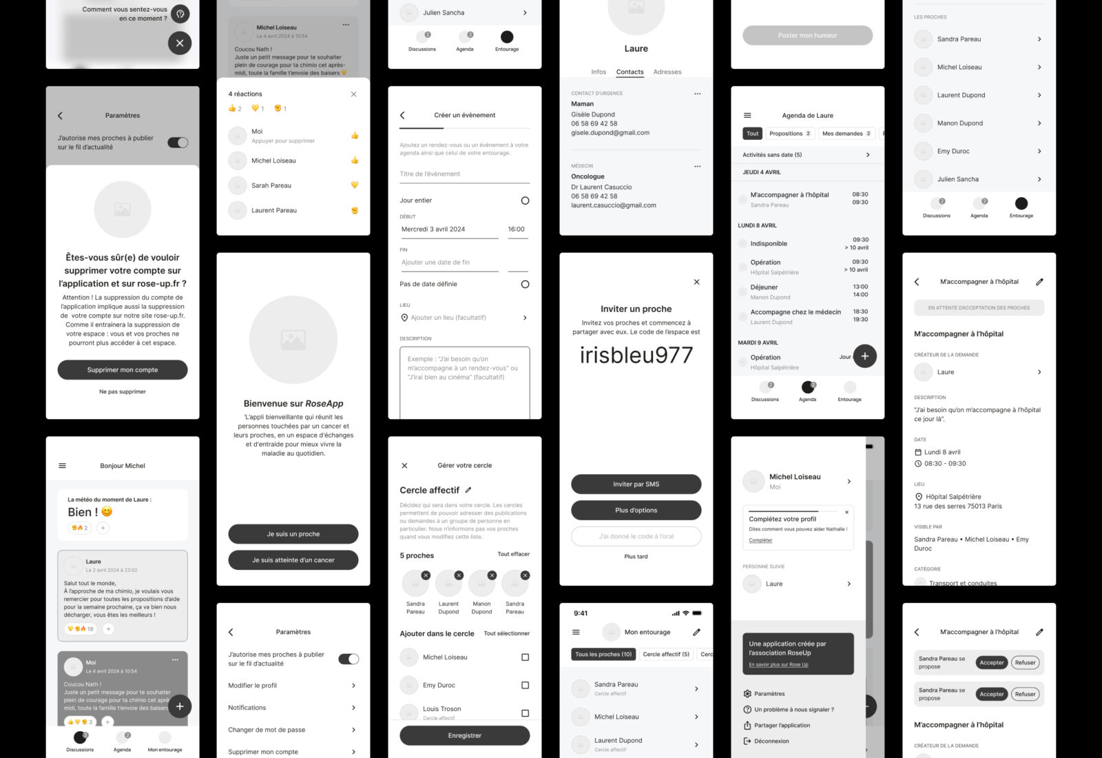
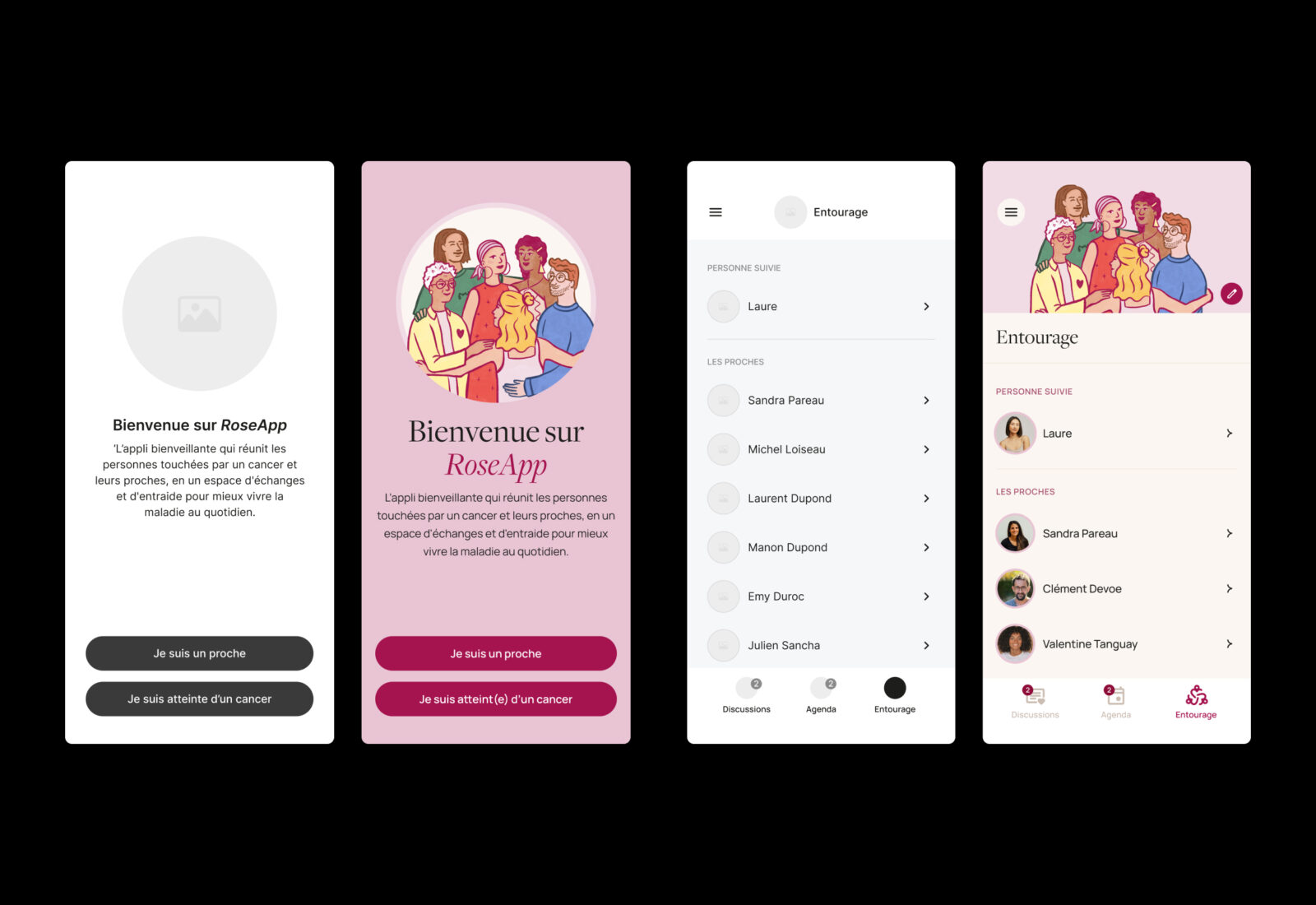
Step three: design and illustrations
- defining the visual style based on validated wireframes
- creating bespoke illustrations to humanise the application
- extending the visual universe through motion design to explain the app simply
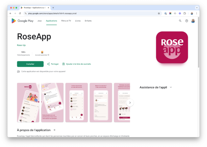
- producing visuals for the App Store and Google Play Store
Step four: specifications and development
-
writing functional specifications, detailed by user journey
-
daily collaboration with Orkester, our technical partner in charge of development
-
meticulous testing of each development phase

Step five: launch and evolutions