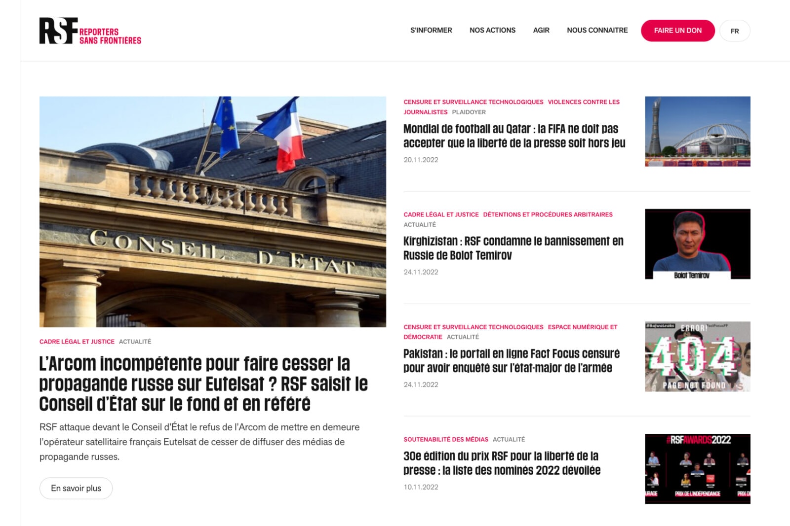
The content has been reorganized around 3 entries:
- information: all of RSF’s rich editorial content
- actions: how RSF works on a daily basis
- take action: contribute to RSF’s fights’informer : tout le volet éditorial riche de RSF


The work carried out on information architecture has made it possible to promote RSF’s actions and broaden its audience.

We redesigned the site’s overall visual identity, using strong elements of RSF’s identity: white, black and red #E40046.


Thanks to our technical partner AOWS, the site benefits from a solid technical foundation for the years to come.
