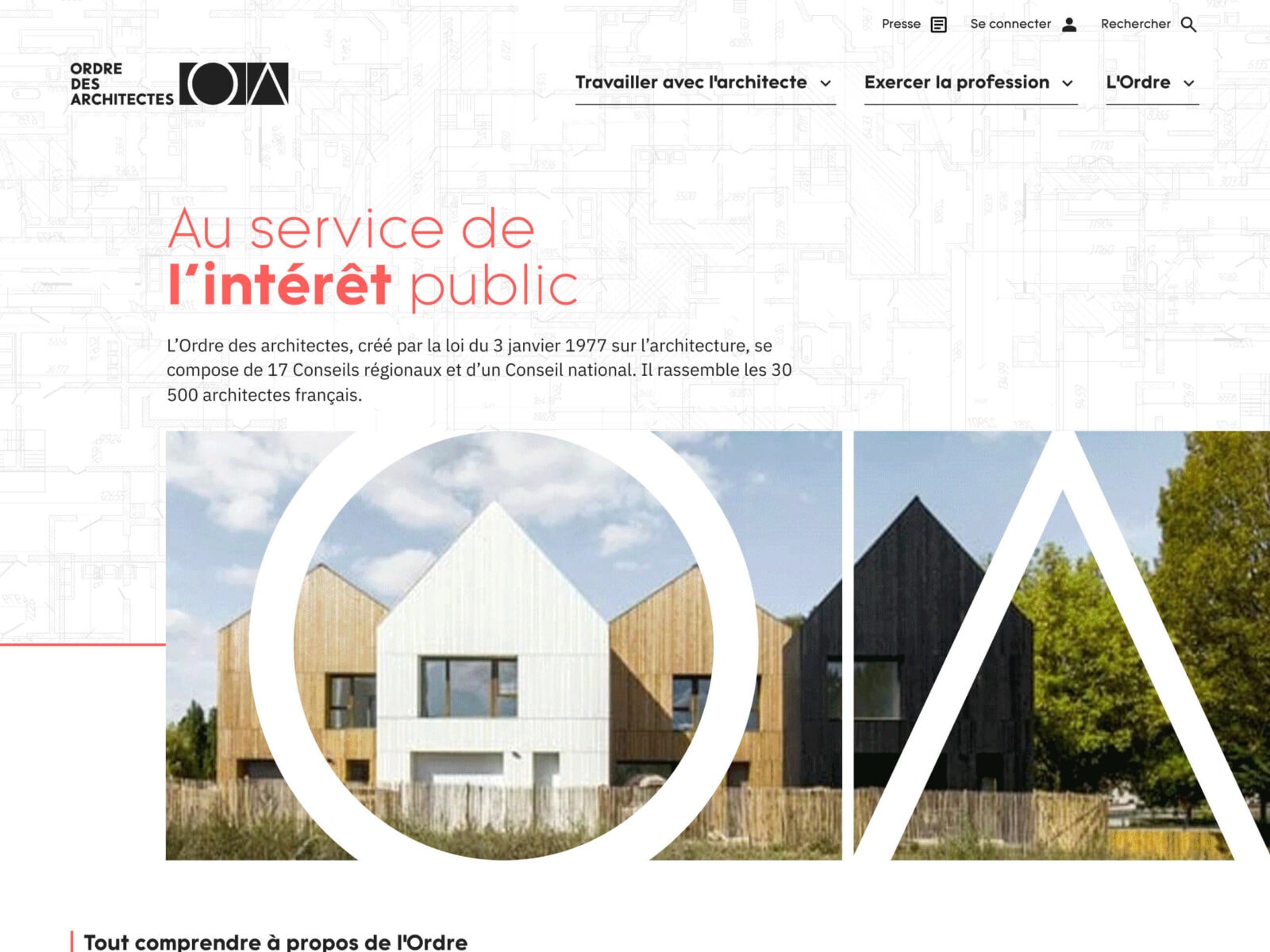
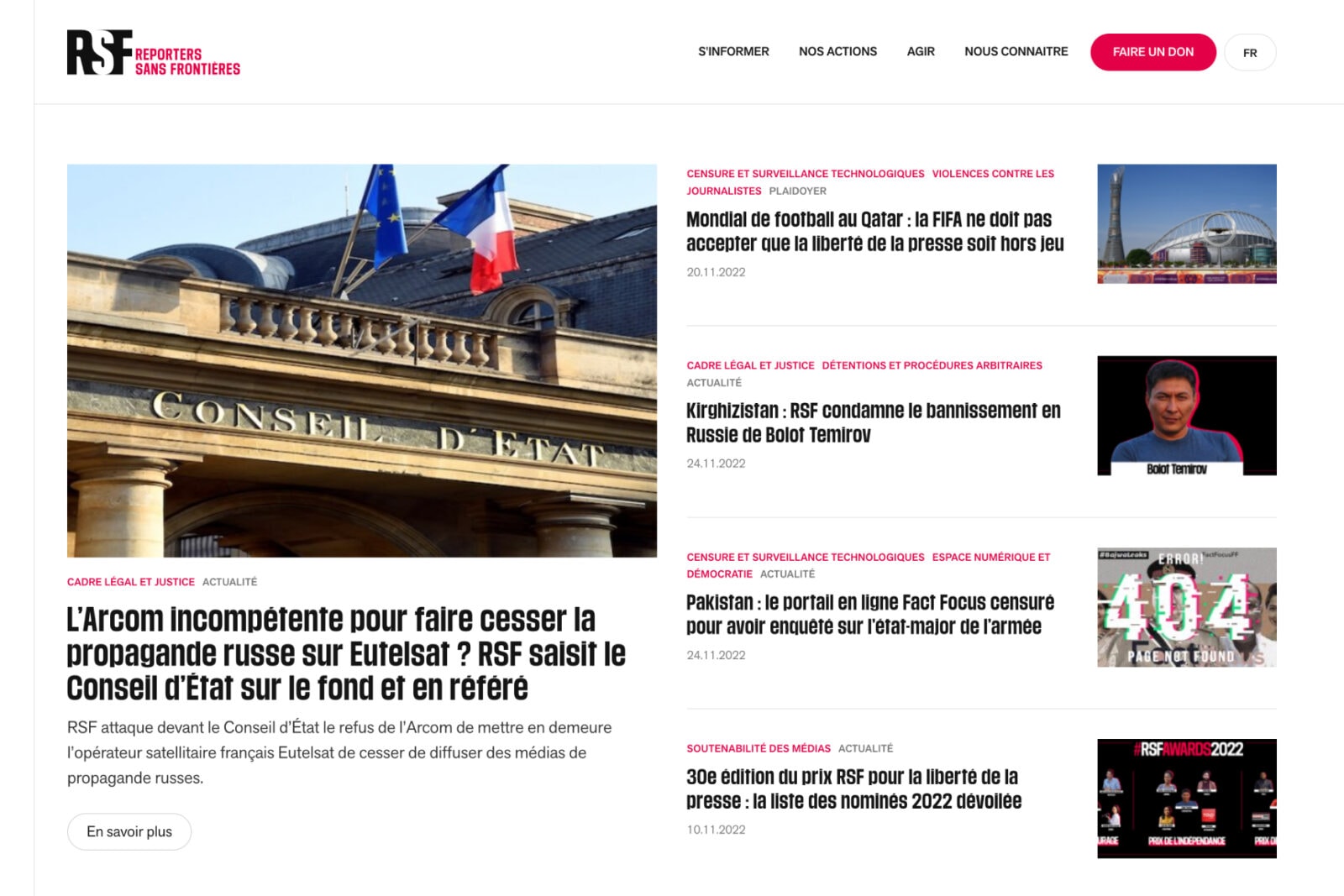
Datagif took part in the redesign, starting with an audit and user workshops to define the scope of the project and the problems encountered with the previous site. We then carried out the entire UX and UI with a new arbo, a completely revised interface and new functionalities to facilitate architects’ daily work. Our mission ended with the writing of functional and technical specifications for the selection of the development provider for the rest of the project.
The redesign project was guided by a technical overhaul as well as an improved user experience for the site’s various audiences (architects, project owners, general public and institutional public). The site adapts according to the user’s status: architects logged into their account now benefit from a personalized experience on the site.
The special feature of this redesign: a site for the national council as well as for the 17 regional councils, each of which must have its own space, with a personalized site for each architect when logging on to his or her account.


Datagif assisted the Order in sorting its content and redesigning its tree structure.
A new warm content template principle, which lists all up-to-date information on a specific subject, accompanied by the necessary resources and the possibility of receiving an alert when an important modification is made.

New customized spaces have been created on the site for the training catalog, documents and publications, classified ads and the architect’s login area.


