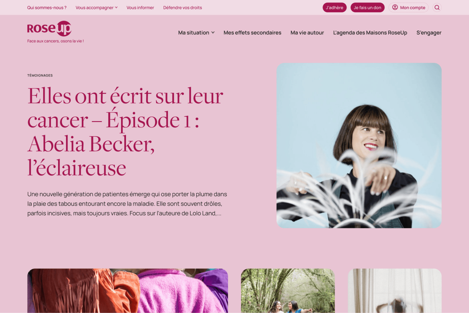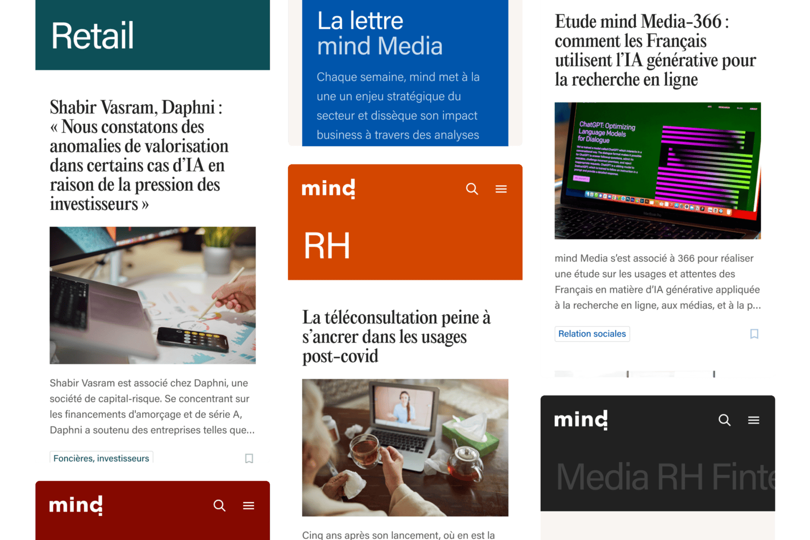
The mind offering was made up of a mosaic of legacy websites, each with its own logic and technical, UX and UI choices, and with visual identities that no longer met today’s standards.
Our first step was to bring order to this ecosystem and define a shared foundation for all the sites. We went back to the essentials: structure, grid system, color palette, typography and technical choices.
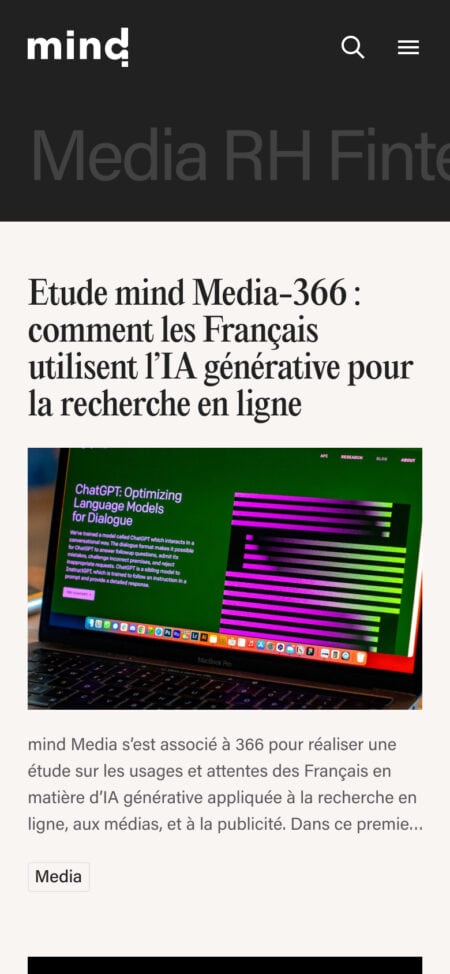
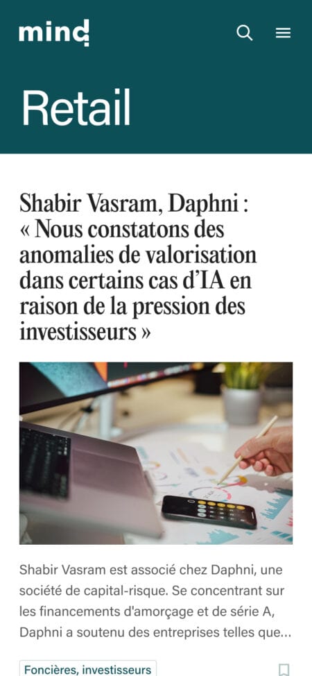
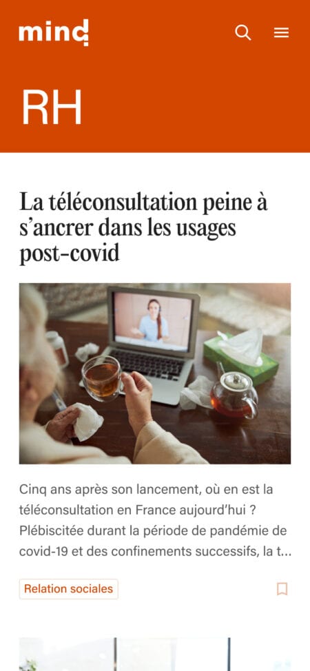
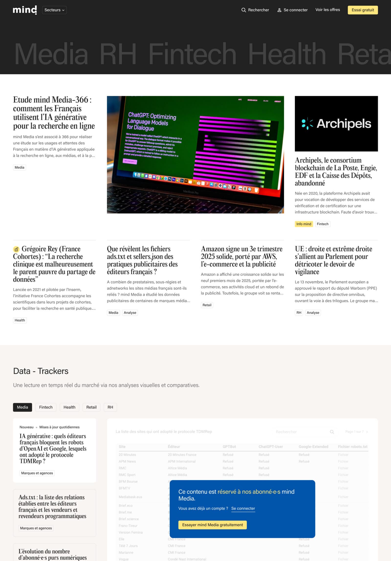
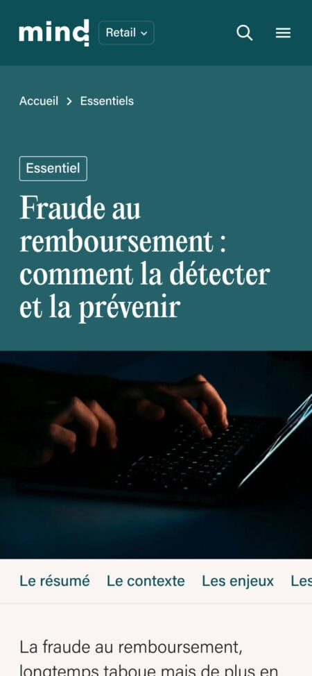
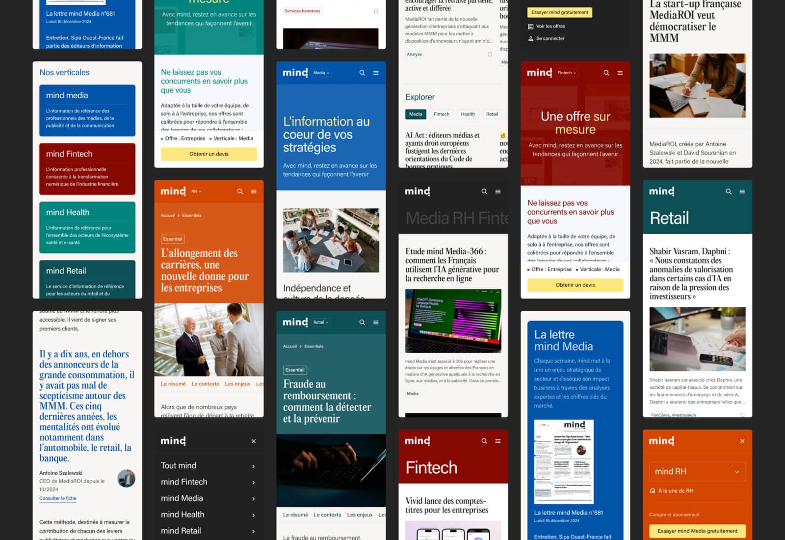
mind is now a single platform, built as a multisite, with a common structure and shared design principles across all verticals. The differentiation between verticals is expressed through color, a long-standing and distinctive element for each one. This shared structure makes the platform more consistent, simplifies navigation between verticals, and supports collaboration and cross-vertical usage, with the additional objective of developing cross-subscription opportunities.
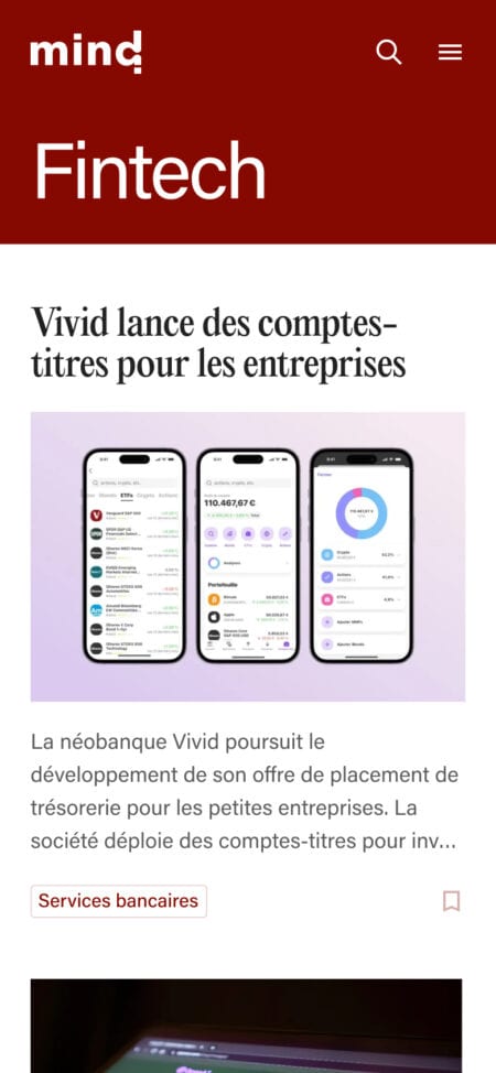

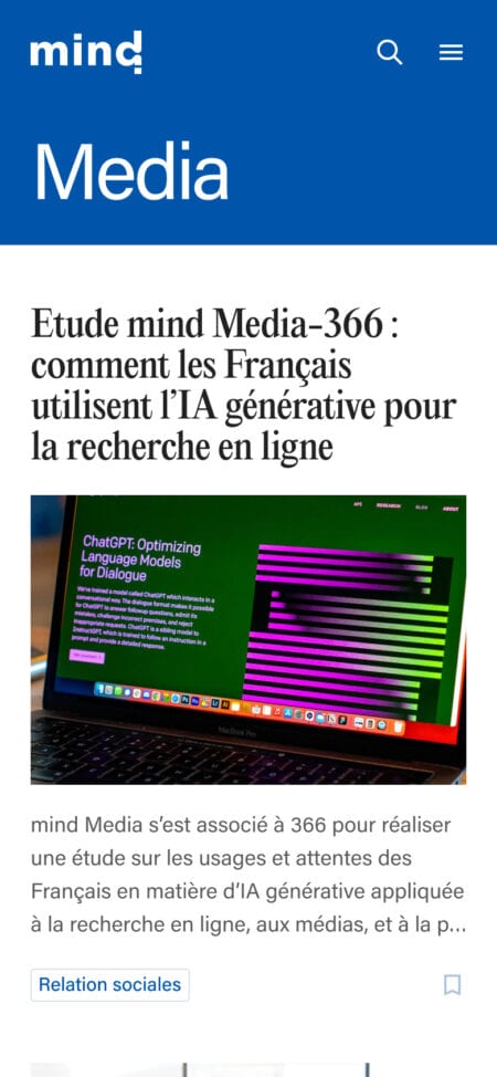
The new grid system was designed to give content center stage: readable text, generous white space, clear visual rhythm, and improved comfort for reading long articles and in-depth reports. The historical color palettes were also subtly adjusted to meet web accessibility requirements.
All of this is brought together in a robust design system, built to scale and ready to accommodate future verticals without disrupting the existing platform.
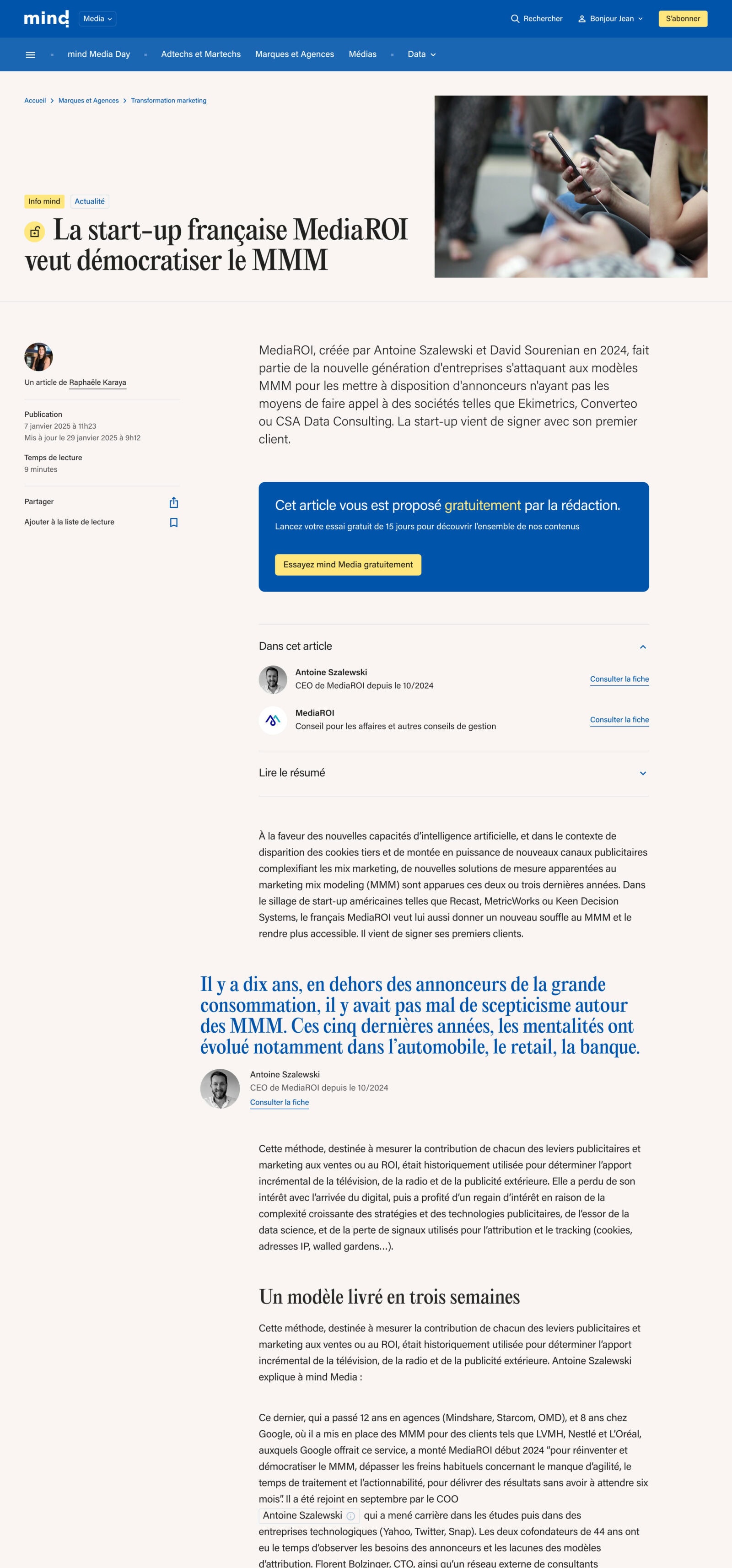
Articles now integrate dedicated modules designed to improve the reading experience:
-
an introductory summary for long-form content
-
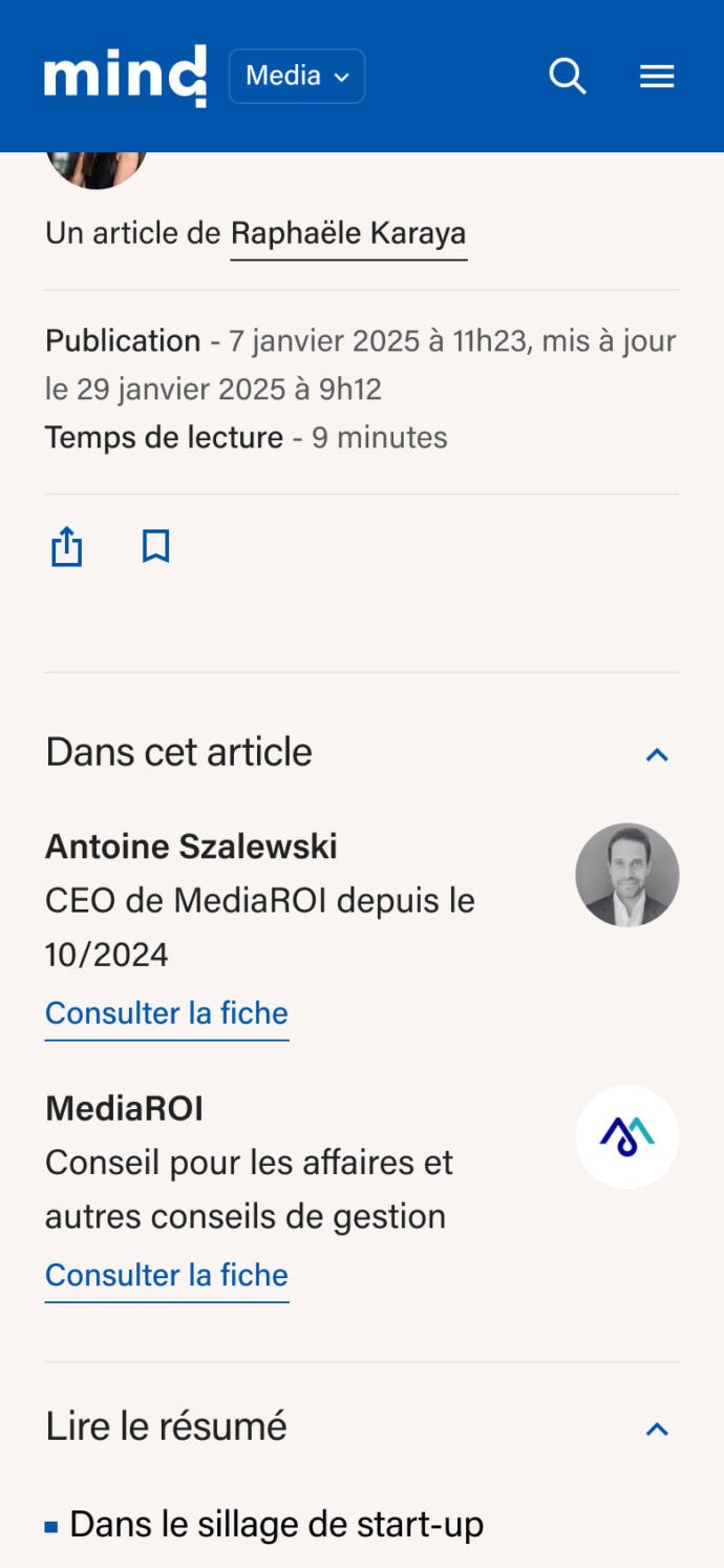
an accordion gathering the companies, personalities and trackers mentioned in the article
-
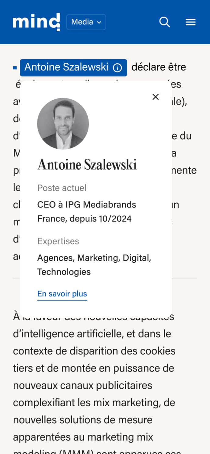
a Wikipedia-style tooltip that instantly displays key information about an actor without leaving the page, while giving greater visibility to the editorial work behind the full profiles
At mind, the richness of content is remarkable: in-depth analyses, confidential briefings, exclusive trackers, databases, and detailed profiles of key market players. These formats required smoother navigation and stronger connections between content.We also reworked the editorial ecosystem as a whole: a single page bringing together all newsletters, whether editorial or automated, a cross-site search experience, cross-vertical content links, and a new homepage that combines the different verticals and their content.
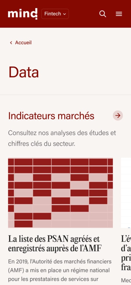
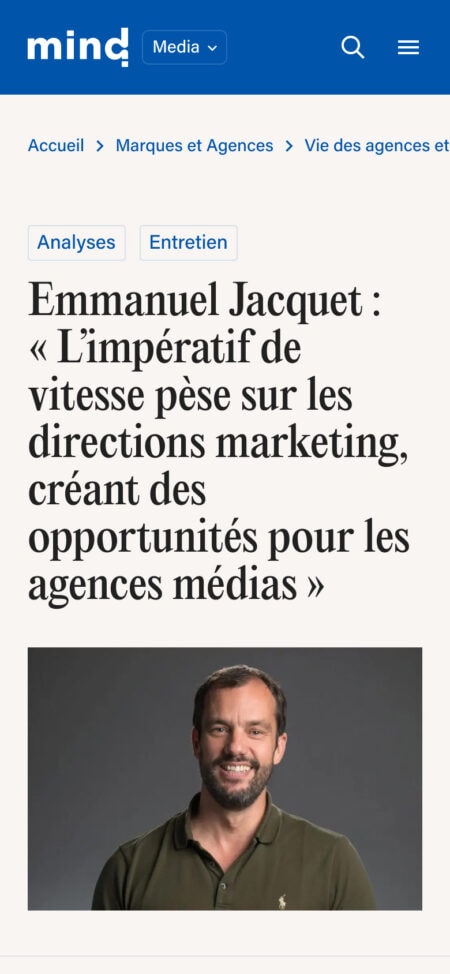
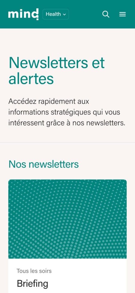
We also reworked the editorial ecosystem as a whole: a single page bringing together all newsletters, whether editorial or automated, a cross-site search experience, cross-vertical content links, and a new homepage that combines the different verticals and their content.
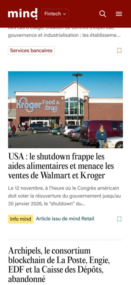
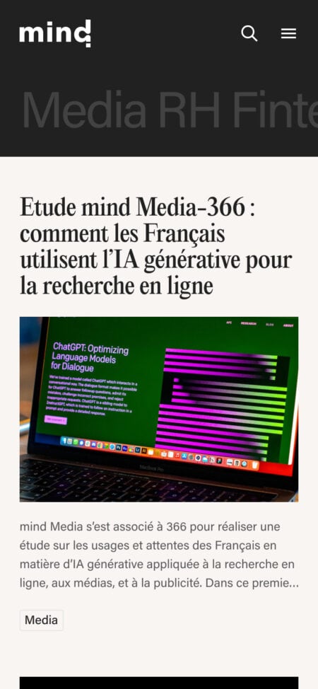
This project was delivered in collaboration with the agency FCINQ, responsible for the website development.